Thursday, December 10, 2009
Vamp and Tramp
I attended the vamp and tramp "lecture" earlier this semester. They are a small business that caters to handmade artist book. I really enjoy bookmaking and letterpress printing, so I found the lecture particularly interesting. It was mostly a sort of show and tell. The man showed us tons of the books they sell. They were amazing. They were really not your average bound book. Each of them really pushed the concept of book, much farther than I've ever seen. There were intricate cut outs and folds. I was really inspired by this showing, especially Julie Chen's work.
Wednesday, December 2, 2009
I have to admit that I haven't accomplished much over the past two days. I have been sitting in front of the computer attempting to make headway but I seem to be wasting a lot of time. I have gone back through my project and edited things that were mentioned in class like the "noisy trees" and the timing of the zooms etc. I have a separate file for the opening scenes that I haven't rendered out yet and replaced but they have been fixed. I'm having a hard time with the parts where the scenery changes from behind the door. I need to the scene and the camera to change smoothly with the fading of the door. This is not an easy transition to make. I have spent hours trying to figure it out. Bottom line is that I have a lot of work to do over the weekend.
Tuesday, December 1, 2009
Working Again.....
Untitled from Taylor Wamble on Vimeo.
So this is part of the work I got rendered for class today. I'm disappointed in the amount I have done. The animation is going fairly quickly, however Im getting caught up in render time. What I have today is fairly glitchy and the movement is not smoothed and refined but it shows whats going on. Im curious as to whether or not the camera angles are working how I'm swithcing them now. I havent explored multiple camera viewpoints in this class thus far.
Tuesday, November 24, 2009
Working
Untitled from Taylor Wamble on Vimeo.
So I have been working over the weekend to change up what was discussed in class last thursday and then have gotten started on the animation of my project. So far things have gone fairly smoothly. I feel like after tackling the last midterm project I have really established a solid knowledge of the program and how to work efficiently. I did encounter some issues last night with the server and after effects so I just went ahead and rendered what I had done and called it a night. I still have a large chunk to go but I'm confident that I will have a complete rough draft by next Tuesday. I will be in town over the weekend and should have plenty of time to come up here.
Still need to work on timing and little glitches. I am going to go through and make the foliage move and create a really dynamic scene.
Thursday, November 19, 2009
Critique Notes
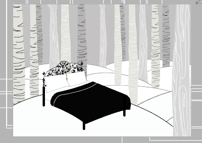
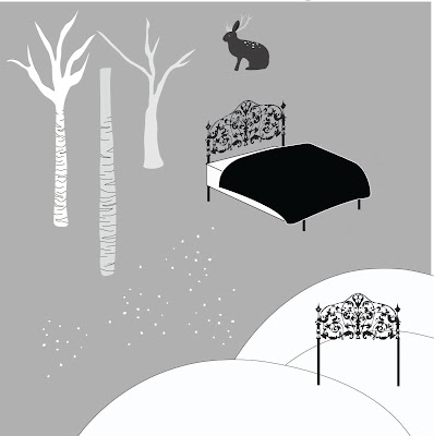
Redesign of bed_need more delicate posts, consider color (not enough contrast on black), also perspective is skewed. A lot of attention needs to be put on this because it is essentially a character. Snowy scene...bed covered in snow?
Winter_hill too stark, don't like line that make the shape. Change to paper texture in very slight grey tones. Consider including some dead foliage, stumps, etc.
Canopy_generally successful
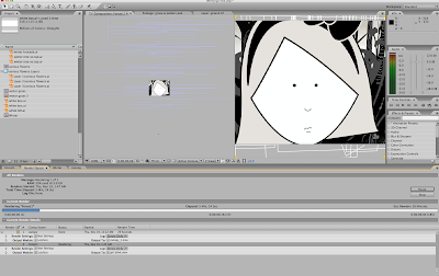
Doesn't look like shes in bed in the waking up scene...looks like shes standing in front of a gate. Pan out more from that scene to see her in bed.
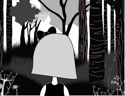
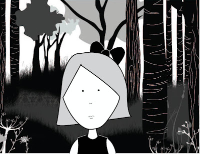
Character design_think about making changes in hair, etc. Bow also, should it be outlined?
To Do:
Make all above changes.
Begin to animate. Would really really like to have a good chunk done for review.
working
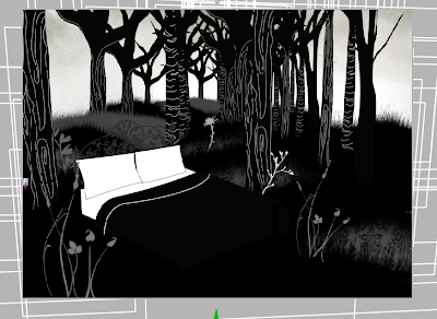
So over the past two days I have spent time staging all of my different scenes.
1. Canopy
2. Waking up
3. Summer
-getting out of bed
4. Fall
5. Winter
-going to bed
I have gone in and restaged all of my assets from last project to consolidate my information. For instance before each tree, hill, flower were all separate. They are now broken down into different layers that may have a flower, tree and hill all included in one. This took a bit of time but in the long run should be beneficial.

Monday, November 16, 2009
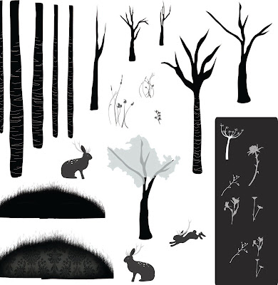
Assets in Scenes
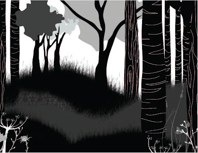
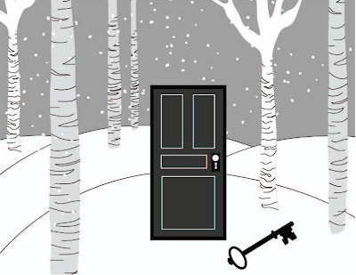
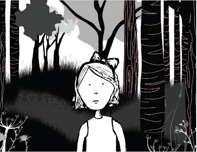
So here are my assets. I was able reuse many of my previous assets but still had a significant amount to make, adjust, etc. I had really hard time trying to make the girl look the way I want her too. I think most of the scenes that show her will be rather quick and just close ups of her face and following her from behind. I would like to adjust her some for sure.
Subscribe to:
Comments (Atom)